Close-up of a hand holding a smartphone with a white and beige box labeled 'Ratios' and '8:11' on a white surface with shadows.

Ratios


SCOPE
• brand identity
• packaging

Ratios is a cannabis extract line formulated with precise cannabinoid combinations for targeted effects. The brand identity blends scientific precision with a clean, timeless aesthetic. A minimalist wordmark incorporates the mathematical ratio symbol into the “i,” paired with a renaissance-inspired colour palette for a subtle artistic touch.

Packaging highlights each product’s unique ratio through bold, scaled typography—for example, an 8:1 THC:CBD formula displays the “8” eight times larger than the “1” for instant visual clarity. The strain lineup is colour-coded for further easy recognition.

Five boxes labeled 'Ratios' in different colors with numbers and ratios on the front, and one box leaning against them with similar labeling.
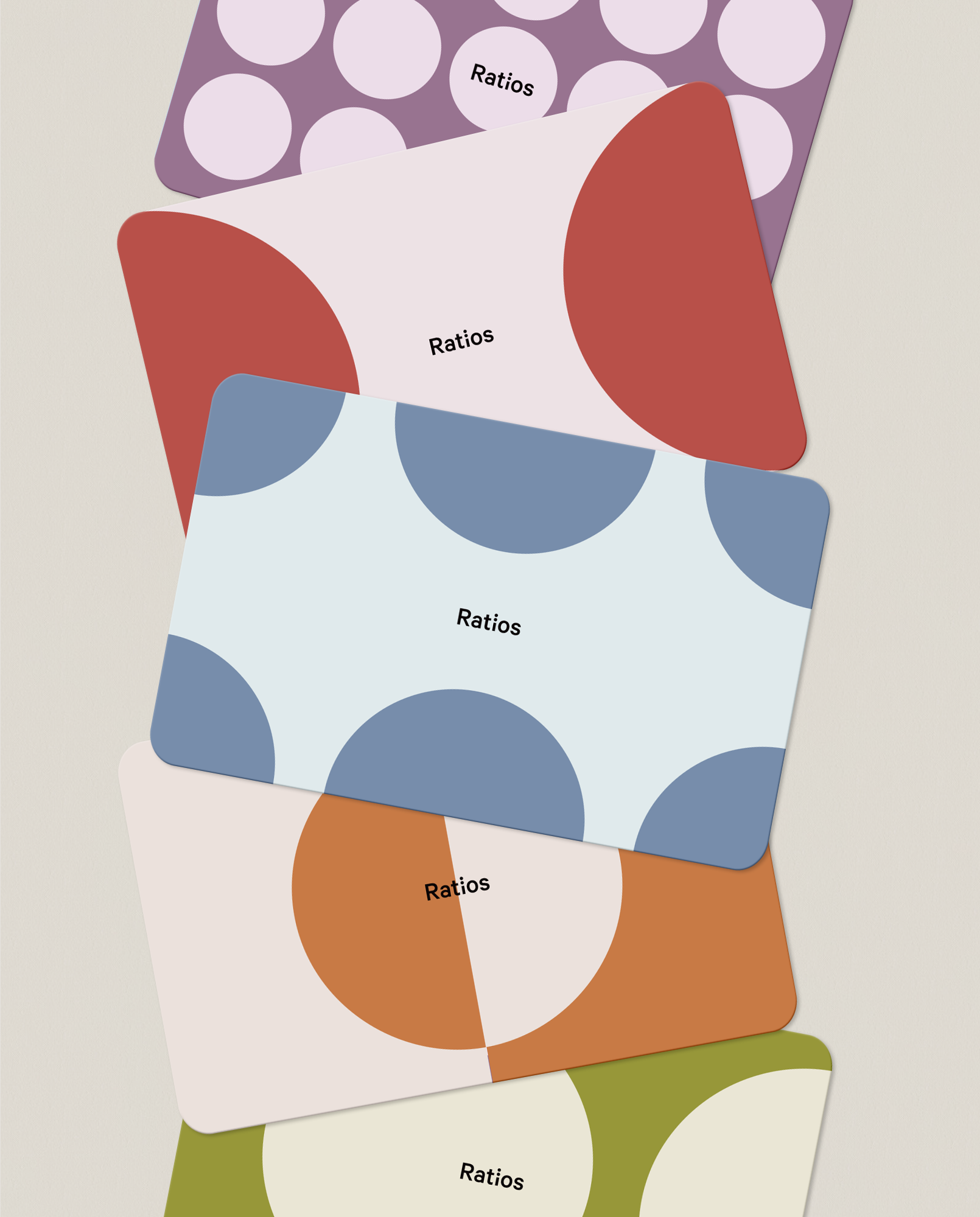
Stacked colorful cards with polka dot designs and the word "Ratios" printed on each.
A brown glass dropper bottle labeled 'Ratios', placed on a textured piece of stone. Behind it, a white box with technical information and the same branding is visible. The setup is on a plain surface with a neutral background.
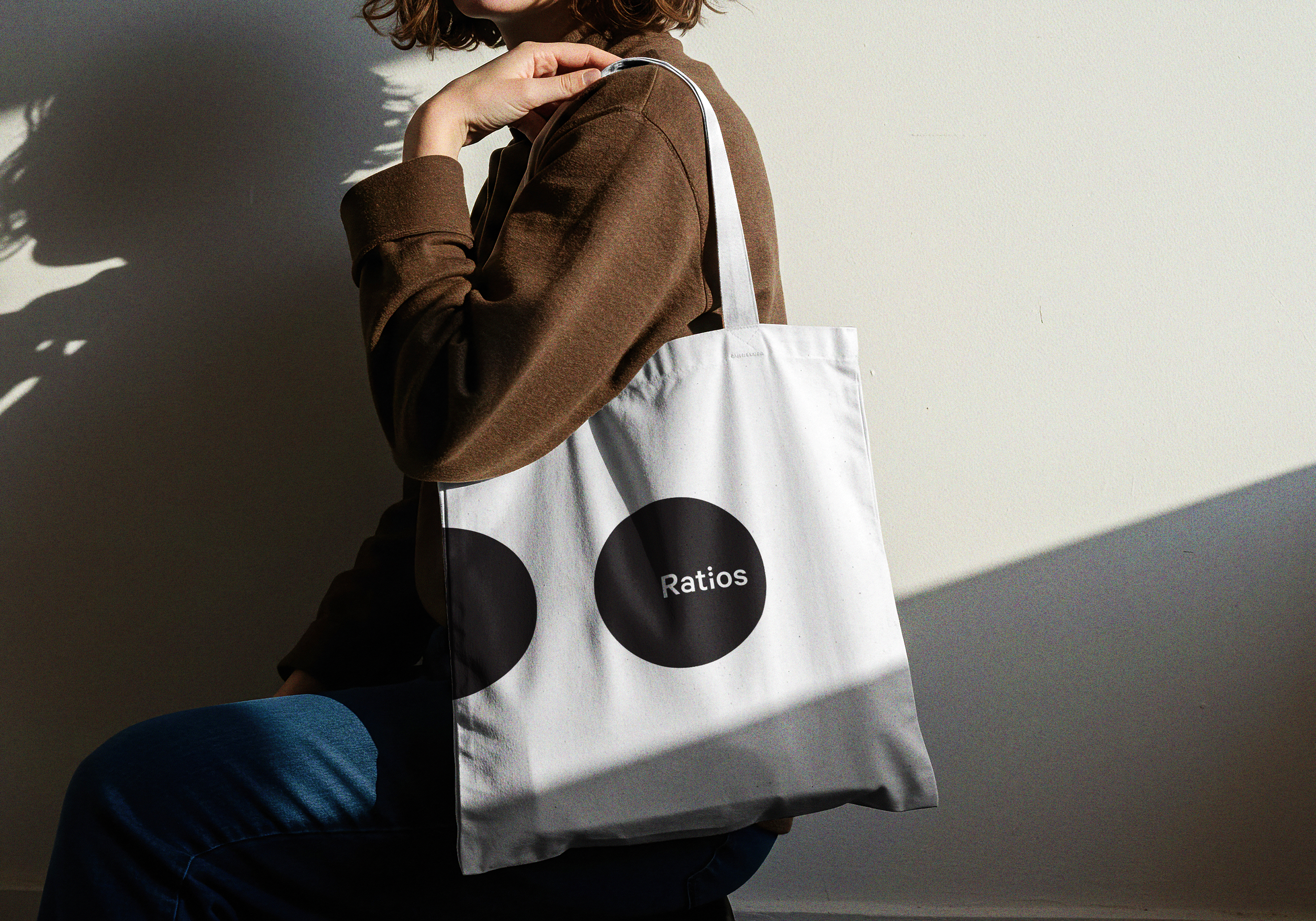
A woman with curly hair wearing a brown jacket carrying a white tote bag with black circle designs labeled 'Ratios' over her shoulder, sitting on a person's lap against a plain light-colored wall.
Close-up of green cannabis leaves against a white background.
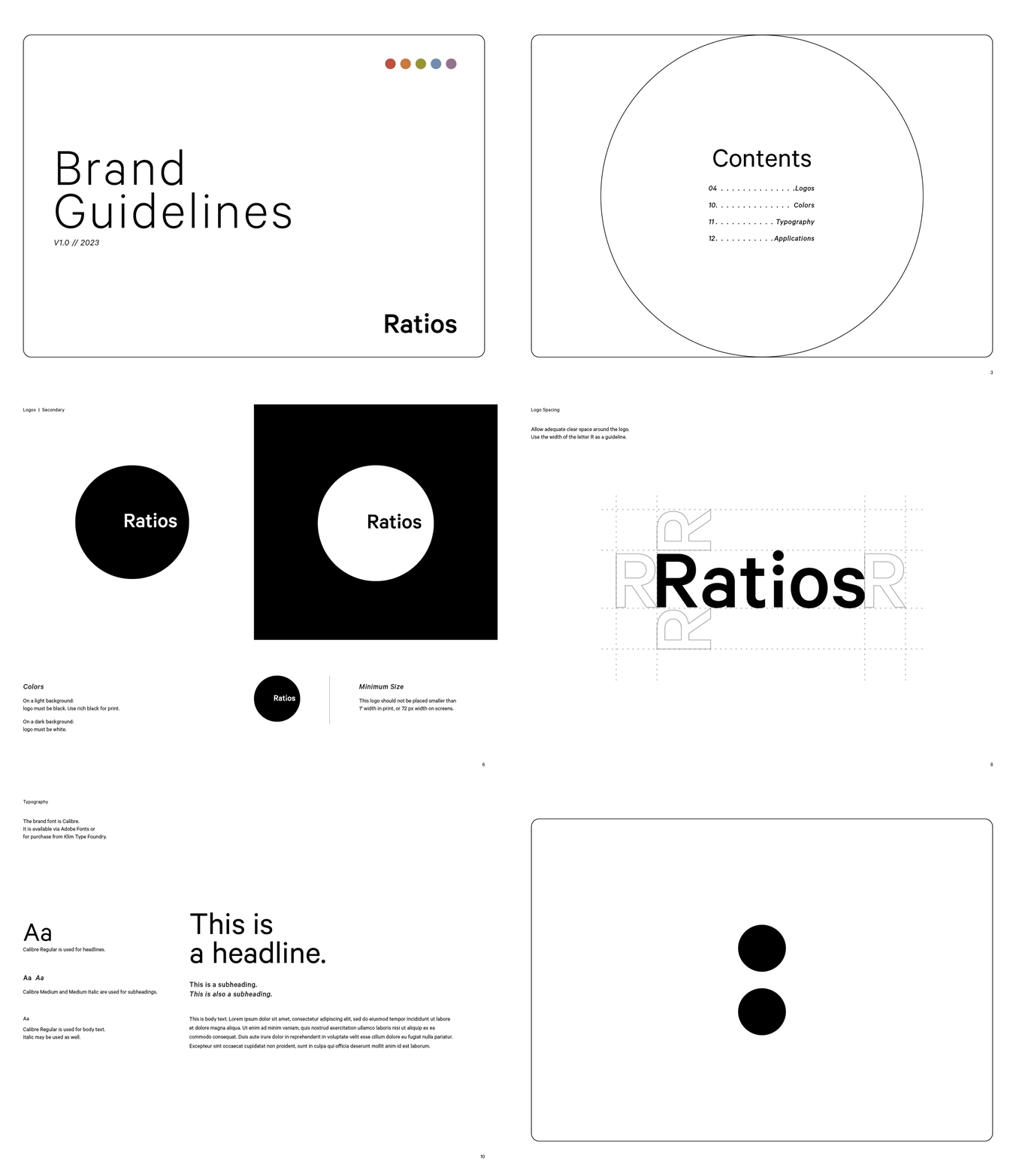
Cover page of a document titled 'Brand Guidelines' with version and year 'V1.0 // 2023' and section heading 'Ratios'.
next project →