Close-up of wooden surface with a portion of a gold-colored letter or number visible.

Signal Acoustics

Precision meets harmony.


SCOPE
• brand identity

Signal Acoustics is a balance of technical mastery and artistic vision. The custom “S” icon, derived initially from the shape of sound waves, and inspired by the form of two tuning forks, represents scientific precision while remaining bold and minimal for easy application. 

Designed with versatility in mind, the mark can be die-cut into metal or laser-engraved onto circuit boards without losing clarity. Paired with a clean, timeless visual aesthetic, the brand communicates trust, craftsmanship, and innovation, aligning with Signal’s mission to create inspiring, acoustically perfect spaces for every scale of project.

Stack of business cards with the text 'signal acoustics' on a black background.
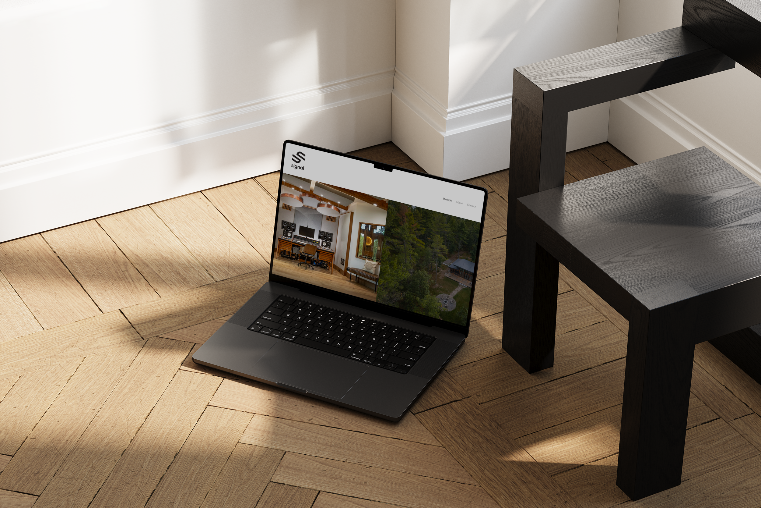
Open laptop on wooden floor showing a website with a music studio and natural scenery on its screen, with a black table nearby, in a room with white walls and baseboards.
Close-up of a digital mixing console with faders and buttons, placed on a wooden surface.
A dark gray surface with the embossed logo and name 'signal' near the bottom right corner.
Recording studio with professional audio equipment, mixing console, speakers, and acoustic panels.
Close-up of a black metal object with cut-out shapes, placed on a wooden surface.
Close-up of a green circuit board with metal screw terminals labeled Ch 1, Ch 2, Ch 3, and Ch 4, attached to a black panel with wiring. In the background, there is a white surface with an orange circle and various electronic components.
next project →